#33: Michael — Typography, Art, Values-Based Design
Life lessons from the designer of my dreams.
Welcome to Mia’s Queue, a newsletter devoted to conscious culture — how taste + curation = connection and personal change. When I’m not exploring what that means in my own life, I chat with an undercover tastemaker infusing creativity and wonder into the world. Today’s post is a bit of a hybrid, reflecting on what I learned while working with Agent 033, followed by his picks. Meet Michael Cina, designer.
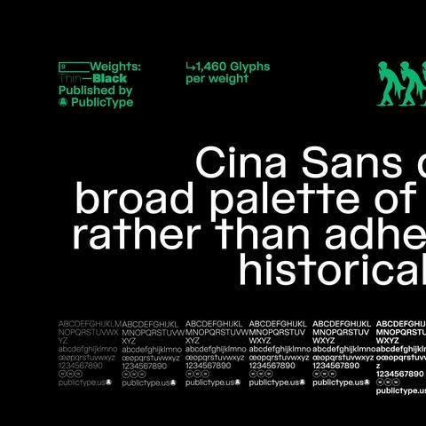
I’m so excited to share a new look and feel for Mia’s Queue. I’ve got a new publication icon, an approach for hero images, a custom (!) font, and my own iconography. I am over the moon. It feels so me.
For this, I thank the designer of my dreams,
, and for introducing me. I had long admired Michael’s work over at and Ghostly. Many times, when Sam posted something, I would breathlessly ask who designed it. Soon enough, I knew the answer: Michael strikes again.So I went for it, pinched myself when Michael said yes, and we immediately got down to business. Our process was hyper-focused, boundaried, and more profound than I expected. Our Southern Italian heritage connected us, but also it was deeper than that. Michael brought his life’s wisdom to this work, and I took away a lot from the process.
• Listen deeply
Michael started by listening intently to what I wanted. I made a Pinterest board that offered a visual representation of “my vibe,” and I explained my loves (collage, neon, rave iconography), challenges (consistency, coherency, time), and wishes (something cool that I could do myself).
• Teach a girl to fish
Michael immediately understood that I needed a system and guardrails, not an answer key handed to me. He armed me with assets, instructions, and a few examples — a bike with training wheels. Now the wheels are off. NGL, it’s a little scary to be trying something new in public, but I will publish even if it’s not “perfect.” It’s part of my staredown with discomfort.
• Push past discomfort
I admit that when Michael first showed me the font, I had a flash of panic. “Oh, this might be too out there for me,” I thought. “And is it too hard to read?” But I told myself to wait before reacting to ensure I understood his vision. When he explained the whole system, I saw the font as an artistic element first and foremost. The fact that it’s unconventional is what makes it so cool. You don’t have to be able to understand what it says instantly. Maybe sitting with it for a while is exactly the point.
• Make it fun
If it was going to be too hard or complicated, it was no good. Michael kept repeating “This should be fun for you.” After a lifetime of shoulds and musts, this felt like a rule I wanted to follow. He said this four or five times. How freeing! How…fun! Now I can’t wait to make images for my posts.
• Put a box around it (literally and figuratively)
You don’t want to waste Michael’s time. I noticed he put a box around everything we did, forcing efficiency. In the template itself, an invisible grid structure keeps me within bounds and provides some of the consistency I was craving. Our collaboration process was streamlined and fast: a few surgical meetings, to-the-point emails, keys to the castle, and scene.
• Good is done
How do you know when art is finished? How do you know when to stop tinkering and fretting? “Good is done” is another thing Michael said to me more than once. I got it. Spend an hour on it. Tweak if necessary, or start fresh if it’s not working. But at the end of the day, don’t overthink it and move on.
I didn’t expect this project to be much deeper than its deliverables. Thank you, Michael, for empowering me with a system and an aesthetic that I love. Thank you for being a true creative angel!
Why did you become a designer?
I was always interested in art, and that's all I've wanted to do with my life. I didn't have any other vision. I was told that being an artist is very tough, so I got into advertising because I thought advertising was design. Two years into college, I changed my major to graphic design. I dropped out of college and just started working all the time, every night and all day, on designing — typefaces, websites, anything. I think in pictures.
What's some of the work that you're the most proud of?
I like to think that I'm the most proud of every project that I do.
My work with Ghostly has been a big thing.
And I just completed a typeface called Cina Sans. I worked on it almost every day for a year and a half.
My work goes beyond aesthetics. It's more interpersonal. That's what I'm most proud of now.
Yeah, that’s one of the things I've loved about working about you. Are you always working on your inner life and that comes through in your professional life?
Yes. It’s the most important thing. What are my values? Who am I as a person? Having that come out in the work is much more satisfying than just being the best designer.
I hit a point in my career where I hit all my goals, and then I thought: Well, what else do I have? I hear people talking about values, and of course, I have them. But how the values meet the work has been something that I've thought long and hard about.
Who or what inspires you?
I love fine art. Music is probably my favorite art form. I love jazz and soul and electronic. At one time, John Coltrane and Herbie Hancock were probably my favorites; groups like Steely Dan and Funkadelic too. House music speaks to me in a way that I don't understand. I listen to pretty much anything that has genuine emotion and authenticity to it.
I love nature; I love going to the middle of the woods and just enjoying the scenery.
I enjoy being a father most of the time.
What are your recommendations for us?
📙 “Visual Thinking: The Hidden Gifts of People Who Think in Pictures, Patterns, and Abstractions” by Temple Grandin, Ph.D.
I will plug this again and again. The book changed my life and helped me understand myself better. I think I wrote a 'stack on this but the title should give it away. I read this within months of also reading “The Highly Sensitive Person: How to Thrive When the World Overwhelms You” by Elaine N. Aron and found it enlightening. Some people say HSP is a personality trait and not a disorder but it's most likely a common trait with neurodivergent people. Both books helped me understand myself a lot better and changed my life.
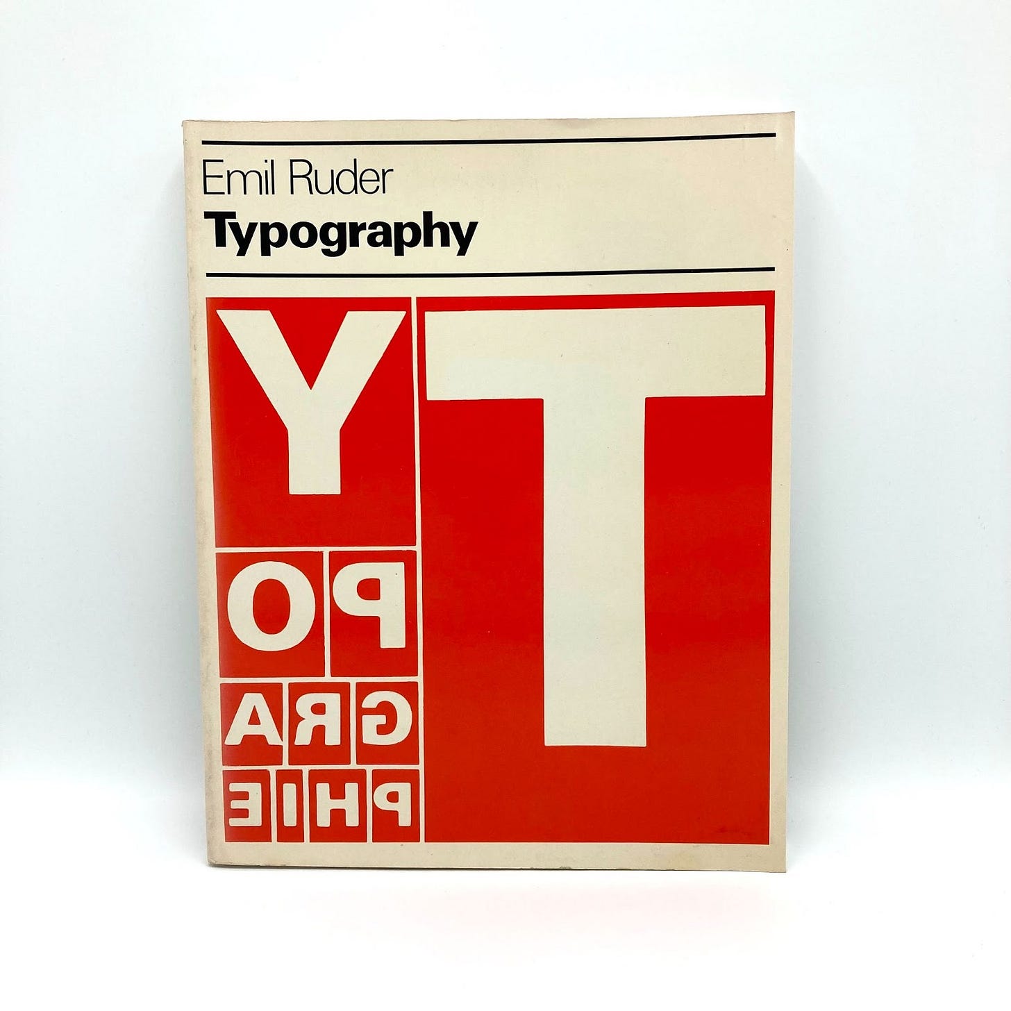
📗 “Typographie” by Emil Ruder
I had just dropped out of college (UNT on a double major of Visual Communication and Fine Art) with a few credits left and I found a copy of this book. To say it changed my trajectory is an understatement. It was one of the main reasons I continued with graphic design. Emil Ruder is one of the key players in the "Swiss Style." It's a very minimal and straightforward approach to typography and communication with a bit of an expressive nature. This paved the way for people like Wolfgang Weingart to break it all apart.
📘 “Blow Up” by Keiichi Tanaami (Amigos is pretty amazing too)
Keiichi just passed recently so I decided I would put him on. I discovered his work 20 years ago and have been a fan ever since. He started out as a Japanese artist/illustrator in Japan during the 1960s, and his work features psychedelic and graphic themes. He was a big inspiration to me and I wrote to him last year to possibly collaborate but his health was waning.
You can follow on Substack and Instagram.
Mia’s Queue is a free newsletter about and for “humans in the loop.” Each edition is full of culture-forward recommendations hand-picked by authentic people who savor the hunt for the Good Stuff, always strive to be their best, and know that sharing is caring. Thanks for being here!


Love this! Excited for the energy that comes from new beginnings!!!
It looks awesome!